03 / PLATFORM MODERNIZATION
Modernizing StaffingNation
Leading a platform-wide UX and UI refresh
By 2024, StaffingNation had grown into a mature enterprise platform, but its visual language, interaction patterns, and information density had not evolved at the same pace. Leadership wanted clients to see meaningful investment in the product while the team introduced international quoting and order creation.
As Product Design Manager, I led the UX vision and design direction for a platform-wide modernization. I remained hands-on in key areas while guiding two designers, improving navigation, redesigning common workflows, and establishing a design system that could support the scale of the product.
The result was a clearer and more consistent experience, improved workflows for heavily used areas like Orders, and a reusable foundation that helped Design and Engineering work more efficiently.
Role
Product Design Manager
Timeline
2024-2026
Platform
Enterprise SaaS
Company
TCWGlobal
A mature platform ready for its next evolution
01 / THE CONTEXT
StaffingNation had evolved considerably since its 2015 rebuild. Over time, the platform absorbed new workflows, user roles, configurations, and business capabilities, while its visual language and layout conventions remained largely unchanged.
The product remained functional and familiar to the people who depended on it every day. Its underlying hierarchy and common interactions were generally well established, but compared with modern enterprise software, many screens felt visually dated and information-dense. Tight spacing, small controls, and older layout conventions made complex workflows feel heavier than they needed to.
At the same time, TCWGlobal needed to bring international quoting and order creation—processes that had largely been managed outside the platform—into StaffingNation. That requirement created an opportunity to improve the surrounding experience while establishing a more contemporary and scalable foundation for future development.
As features expanded and customization increased, some of the older patterns no longer held up.
Platform growth
New workflows, roles, configurations, and business capabilities had expanded the scope of the platform.
Interface evolution
The established visual language and layout conventions no longer reflected modern enterprise product expectations.
Business trigger
International quotes and orders needed to move into StaffingNation without disrupting familiar workflows.
The challenge was to modernize the product in a way users would immediately recognize as better, without making the workflows they already understood feel unfamiliar.
Improving the product at three connected levels
02 / THE MODERNIZATION STRATEGY
We did not approach the modernization as a visual refresh applied screen by screen. Instead, each product initiative improved three connected layers: the interface users saw, the workflows through which they completed their work, and the shared foundation used by Design and Engineering.
Because StaffingNation was already functional and familiar, the strategy was evolutionary rather than disruptive. We preserved its core mental models while making complex work feel clearer, more contemporary, and easier to extend.
01
Experience
Make the interface feel clearer and more contemporary
Typography, spacing, information density, and page layouts
02
Workflows
Give complex work more room and make recurring tasks easier.
Grids, quick views, full-page records, forms, and creation flows
03
Foundation
Make improvements repeatable across the platform.
Shared components, interaction patterns, and governance
Preserve what users already understood. Modernize the system around it.
Familiar structures remained in place while clearer, more scalable patterns improved the experience around them.
Creating a more predictable way to work
03 / PLATFORM-WIDE PATTERNS
Instead of redesigning every screen as a separate problem, we identified recurring ways users navigated, reviewed records, and completed work across StaffingNation.
We then created shared patterns that could be applied across product areas. This made the experience more predictable for users and gave Design and Engineering a reusable approach to recurring interface problems.
STARTING WORK
Navigation and global creation
We refined the product’s navigation and introduced a global Create action that gave users a consistent starting point for common creation workflows.
Previously, users often had to navigate into a specific product area before beginning a task. The global action made important workflows accessible from across the application while preserving the broader navigation structure users already understood.
Users could begin common workflows without first navigating to their destination.
REVIEWING INFORMATION
Clearer, more scannable data grids
Grids remained central to StaffingNation because users frequently reviewed and acted on large sets of orders, workers, candidates, and other records.
Rather than removing necessary information, we used spacing, typography, status treatments, and clearer row actions to make dense datasets easier to scan and understand.
The interface preserved access to detailed data while making important information easier to identify.
MOVING BETWEEN CONTEXTS
Quick views and full-page records
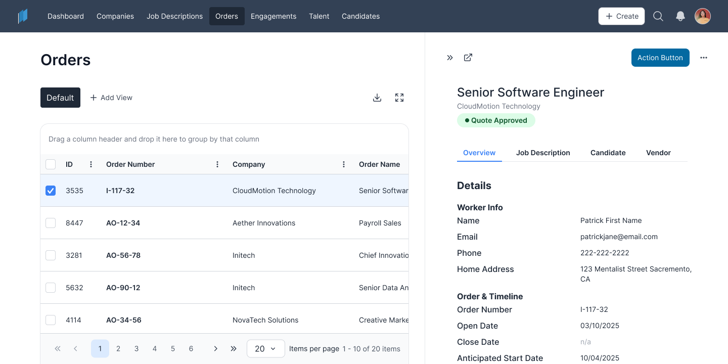
We created two complementary ways to work with major records: a side-panel quick view for browsing and lightweight actions, and a full-page experience for detailed or focused work.
The redesigned side-panel quick view, internally called a pusher, opened beside the grid instead of covering it. Users could keep the surrounding list visible, move between records, and compare information without repeatedly closing and reopening the panel.
The same record architecture supported both fast review and focused work.
COMPLETING COMPLEX WORK
Full-page forms
Larger creation workflows had outgrown the constrained patterns previously used for detailed forms.
We moved major workflows into full-page experiences with clearer sections, stronger grouping, and more room for supporting information, conditional requirements, and workflow-specific guidance.
Complex workflows gained more room without introducing an unfamiliar interaction model.
Consistency builds confidence.
Users should not have to relearn the product as they move between workflows. Shared layouts and interaction patterns allowed knowledge from one area of StaffingNation to carry into another.
Orders became the clearest demonstration of how these platform-wide patterns could improve an important workflow while supporting entirely new capabilities.
04 / FEATURED EXPERIENCE
Modernizing Orders
Orders became the clearest test of the modernization strategy. The existing experience was familiar and functional, but its dense presentation and overlay record view left limited room for comparison, focused work, and more complex requirements.
Rather than simply refreshing the interface, we redesigned the underlying Orders architecture to support faster record review, deeper management, and domestic and international creation within one coherent experience.
From constrained review to continuous context
BEFORE
A constrained record experience
Opening an order covered the surrounding grid, making it harder to retain context or compare records.
AFTER
Review without losing the list
The redesigned quick view opened beside the grid, allowing users to move between orders while keeping the surrounding records visible.
One experience, three levels of focus
Orders grid
Scan, filter, and compare records.
→
Quick view
Review essential information and move between orders without leaving the list.
→
Full-page record
Manage complete order details and perform more focused work.
One experience, three levels of focus
Moving order creation into a full-page experience gave detailed workflows more room for clearer grouping, supporting information, and conditional requirements.
We used the same broader Orders architecture to bring international quotes and orders into StaffingNation without creating a separate product experience. Familiar navigation, record patterns, and page structures remained in place while additional requirements appeared when relevant.
Shared architecture
Domestic and international orders used the same core creation and record patterns.
Conditional complexity
Additional information and steps appeared only when the workflow required them.
Familiar experience
Users gained new capabilities without learning an entirely separate system.
OUTCOME
The redesigned Orders experience created a flexible path from browsing and comparison to detailed management and domestic or international creation.
It improved an established workflow while giving StaffingNation room to support significantly broader business needs.
05 / DESIGN SYSTEM
Rebuilding the visual system for scale
StaffingNation already had a coherent interface and reusable patterns, but its visual system was rooted in the earlier product and much of its logic lived in my design files and working knowledge.
For the modernization, we redesigned every major foundation and core component, including typography, spacing, color, controls, statuses, tables, navigation, and page layouts, while preserving the workflows and mental models users already understood.
We then formalized those decisions into a scalable design system that multiple designers could use, extend, and apply consistently across the platform.
Rebuilding the visual language
The new system reduced visual weight, improved readability, and gave complex workflows more room. The product remained recognizable, but nearly every visual building block used to express it was redesigned.
The workflows stayed familiar. The system around them was rebuilt.
Scaling beyond one designer
As the sole designer, I had previously been able to maintain consistency through direct knowledge of the product and its design files. A growing team needed that logic to be more explicit.
We organized components, expanded variants, documented important usage decisions, and established clearer standards for introducing or modifying patterns. This allowed the other designers to contribute more independently without relying on me to explain or approve every detail.
Documented component states
Reusable workflow patterns
The system applied in product work
The system was expanded through real product work, including Orders, grids, forms, quick views, record pages, and navigation.
Connecting design and development
The design files used shared components, but that reuse was not always mirrored in production. Visually similar components were sometimes implemented separately rather than extending an existing coded component.
The product could appear consistent while still containing duplication behind the scenes. That made broad interface updates harder because changing one component did not necessarily update every place where the same pattern appeared.
During the modernization, clearer documentation, earlier collaboration with Engineering, and continued implementation review helped identify reusable patterns before build and reduce further duplication.
Design system
Canonical components
Defined states, variants, behavior, and usage guidance
→
Coded components
Reusable implementation
Shared structure and behavior used across workflows
→
Product experience
More consistent updates
Changes could be applied more efficiently across the product
A reusable design component creates the most value when its coded implementation is reusable too.
A more modern product, and a stronger foundation for continued development
06 / OUTCOME
Clearer experience
Updated typography, spacing, layouts, grids, forms, and record experiences made complex enterprise workflows feel more contemporary and easier to scan.
Expanded capability
International quotes and orders moved into StaffingNation while remaining connected to the product’s familiar navigation, record architecture, and creation patterns.
Greater consistency
The redesigned visual system and reusable interaction patterns created a more cohesive experience across product areas and gave multiple designers a shared foundation for future work.
Stronger delivery foundation
Reusable components, clearer documentation, and closer implementation review reduced repeated design decisions and helped prevent additional component fragmentation in development.
Modernizing without erasing what already worked
REFLECTION
The work received positive feedback from clients, internal teams, and Engineering. The design system helped the team move more efficiently, while the updated patterns gave future product initiatives a clearer starting point.
The value did not depend on one dramatic launch. It came from applying a connected set of improvements across the platform and changing how future experiences could be designed and built.
We preserved the workflows users already understood while rebuilding the system around them for StaffingNation’s next stage of growth.
The result was a product that felt meaningfully more modern without becoming unfamiliar—and a stronger foundation for continuing to evolve it.