01 / PRODUCT FOUNDATION
Building StaffingNation 2.0
Creating a scalable foundation for future growth
StaffingNation supported TCWGlobal’s core contingent workforce process, but its underlying technology could not support the company’s plans for continued growth. In 2015, TCWGlobal chose to rebuild the platform from the ground up, creating an opportunity to improve both the technical foundation and the user experience.
As the sole UX Designer, I designed the new application’s information architecture, navigation, core workflows, and reusable interaction patterns while partnering closely with Product and Engineering throughout development.
The result was a clearer and more consistent product foundation that supported years of expansion beyond the original order, offer, and worker-onboarding workflows.
Role
UX Designer
Timeline
Started in 2015
Platform
Enterprise SaaS
Company
TCWGlobal
01 / THE CONTEXT
Why a ground-up rebuild was necessary
The product worked for the present, but it could not support the future.
StaffingNation is TCWGlobal’s proprietary contingent workforce management platform.
At the time of the rebuild, the product supported a focused set of activities:
Creating a work order
Sending an offer to an identified worker
Guiding the worker through onboarding
These workflows met the company’s immediate operational needs, but the technology behind the product had become a barrier to growth.
Continuing to build on the existing platform would have limited TCWGlobal’s ability to introduce new services, support more customers, and expand StaffingNation into a broader enterprise product.
The rebuild also created an opportunity to improve a user experience that was difficult to navigate and lacked the clarity and consistency the company wanted for its clients and internal teams.
The goal was not to reproduce Version 1 screen by screen. It was to preserve the essential business process while designing a stronger product around it.
The original StaffingNation experience supported the core business process, but its navigation, interface patterns, and technical foundation limited how the product could evolve.
Existing product
Built for immediate operations
One order, offer, and onboarding path
A limited set of users and capabilities
The company’s current operational needs
New foundation
Built for continued growth
Additional services and engagement types
More customers, roles, and workflows
New product capabilities
Long-term expansion
02 / MY ROLE
Owning the UX foundation
I owned the end-to-end user experience for the rebuild.
Working directly with product owners and engineering, I translated the existing business process into a new application structure and designed the workflows, navigation, interaction patterns, and visual interface used throughout the product.
Because I was the sole UX designer, I worked across the entire application rather than owning one isolated feature. This gave me a broad view of how individual design decisions affected the larger system and allowed me to establish patterns that could be reused as the platform expanded.
Responsibilities
Information architecture · Navigation design · Workflow design · Wireframing · Interaction design · Visual design · Prototyping · Implementation collaboration
Team
Sole UX designer working with product and engineering
Tools
Photoshop · Sketch · InVision
The central design challenge
Design for the workflows we understood, without limiting the workflows that had not yet been defined.
The new product needed to work well for its current scope while remaining flexible enough to support capabilities the company had not yet fully planned.
03 / WORKFLOW STRATEGY
Designing around work, not legacy screens
Rather than recreating Version 1 screen by screen, I started with the work users needed to accomplish.
The core experience connected three major activities:
1. Create an order
Define the role, employment details, pay, dates, reporting relationships, requirements, and approval needs.
2. Send an offer
Select the worker, confirm engagement details, assign approvers, and prepare the offer and onboarding requirements.
3. Onboard the worker
Collect information, complete documents, track requirements, and prepare the worker to begin the engagement.
Understanding this lifecycle helped determine what information users needed at each stage, which decisions belonged together, and how one step should lead into the next.
The core StaffingNation lifecycle connected order creation, offer management, and worker onboarding into one continuous process.
04 / Design Principles
Principles for a scalable foundation
Organize around user tasks
The product’s structure needed to make sense from the user’s perspective rather than simply reflect how information was stored in the system.
I organized navigation and page structures around the major areas of work, including companies, job descriptions, orders, engagements, and talent.
The goal was to help users develop a reliable mental model of the application so they could understand where information belonged and move through the product with less hesitation.
Reveal complexity progressively
Orders and offers required a substantial amount of information.
Rather than presenting every field and decision at once, I grouped related details into logical sections and introduced conditional information when it became relevant.
The goal was not to pretend the work was simple. It was to give that complexity a clear and manageable structure.
Make patterns reusable
The rebuild required many forms, tables, dialogs, statuses, and multi-step workflows.
Designing each interaction differently would have made the application harder to learn and harder to expand. I created repeatable patterns for viewing records, starting workflows, entering information, confirming actions, and displaying progress.
Users should be able to learn an interaction once and apply that knowledge throughout the product.
05 / CORE EXPERIENCE
Creating clear entry points
The order experience needed to support more than one starting point without forcing every user through the same process.
Some users needed to create a general order before a worker had been selected. Others already knew who they wanted to hire and needed to create the order and begin the offer process together.
The interface distinguished between these paths early.
A routing question helped users select the appropriate workflow before they were asked to enter detailed information. Actions such as Create Order and Create Order & Send Offer were paired with descriptions that explained what each option would do.
This reduced unnecessary steps and gave users more confidence that they were beginning the correct process.
Clear descriptions helped users choose between creating an open order and creating an order for a worker who had already been identified.
Design principle
Start with the decision the user is trying to make, not the form you want them to complete.
06 / COMPLEX WORKFLOWS
Giving detailed work a clear structure
Orders and offers could require information about employment details, pay, dates, reporting relationships, approvals, documents, worker selection, and onboarding requirements.
Presenting all of this information as one long form would have made the experience difficult to understand and review.
I divided the workflows into logical sections and connected related decisions within a clear sequence. Conditional options appeared only when they were relevant, reducing unnecessary information without hiding important requirements.
The offer workflow, for example, brought together engagement details, pay information, approvers, worker selection, and onboarding documents within one connected process.
Each part of the workflow used familiar patterns so users could understand what was required, see where they were in the process, and review their decisions before moving forward.
Related employment and engagement details were grouped into predictable sections, helping users navigate a detailed workflow without losing context.
This is the original form design with field labels on the left. They were later move above the fields to accommodate longer field names (seen below).
Conditional information: Additional fields and requirements appeared when they became relevant to the user’s selections.
Approvals and worker selection: Related decisions were kept within the same workflow so users did not have to move between disconnected areas of the application.
Onboarding requirements: Offer creation connected directly to the documents and tasks the worker would need to complete during onboarding.
07 / REUSABLE PATTERNS
Making recurring interactions predictable
Consistent page structure
Scalable navigation
The future scope of StaffingNation was not completely known when the rebuild began.
That meant the product could not be optimized only for the three workflows that existed at the time. Its structure needed to accommodate new sections, actions, user roles, and workflow variations without requiring the entire experience to be reorganized.
I established shared conventions for:
Page headers and primary actions
Record lists and detail views
Forms and field groupings
Dialogs and confirmations
Statuses and progress indicators
Multi-step workflows
Navigation between related records
These patterns created consistency for users and gave product and engineering a reusable foundation for future development.
Instead of treating every new screen as a separate design problem, the team could extend established patterns and preserve a coherent product experience.
State-driven experiences
Record Management
Guardrails and confirmation
08 / THE RESULTING EXPERIENCE
The Resulting Experience
The rebuilt StaffingNation connected the company’s core workforce process within a more structured and consistent application.
Users could move from creating an order to sending an offer and onboarding a worker through workflows that shared the same navigation, layout conventions, interaction patterns, and visual language.
The design did not remove the complexity of contingent workforce management. It organized that complexity so users could understand what they needed to do, make informed decisions, and move through the process with greater confidence.
Consistent navigation, page layouts, and record-management patterns created a predictable experience across the application.
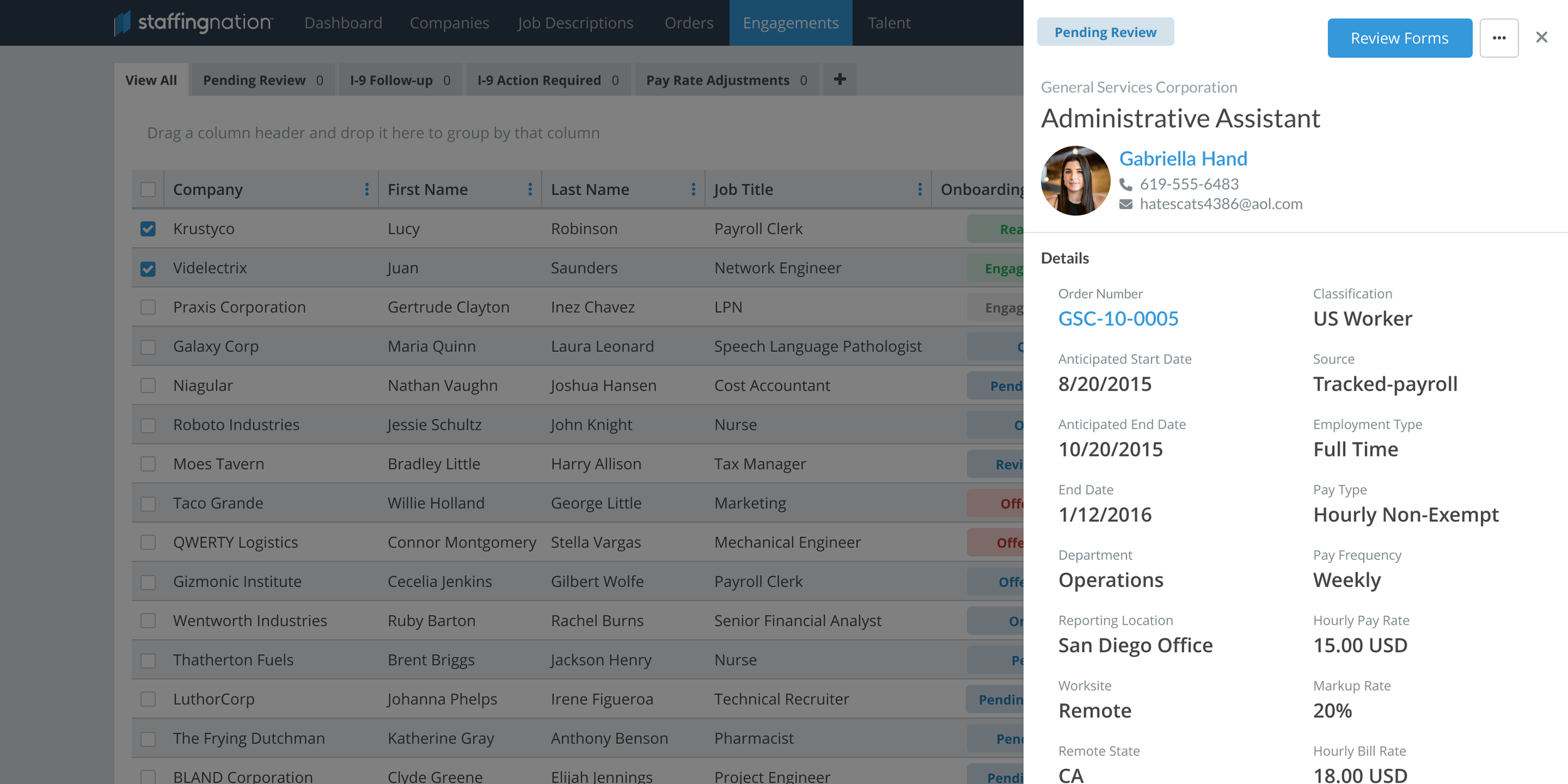
Reusable detail panels provided a consistent way to review records and complete common actions throughout the application.
A guided onboarding experience helped workers complete documents and requirements before beginning an engagement.
Related information was organized into clear sections, making complex order creation easier to complete and review.
A note about the archive
The surviving design archive includes artifacts from the original rebuild alongside later revisions and explorations.
The screens shown here were selected to represent the product structure and design patterns established during the rebuild. Where a later iteration is included, it is labeled accordingly.
09 / OUTCOME
A foundation the product could grow on
01 / Modernized the platform
Replaced a legacy platform that could no longer support growth.
02 / Improved core workflows
Simplified navigation and usability across the workforce lifecycle.
03 / Created reusable patterns
Established shared interaction and layout patterns across the application
04 / Built for future growth
Created a scalable foundation that supported years of product evolution.
The clearest long-term measure of its impact is the platform’s longevity. The rebuilt foundation supported years of continued product development and became the starting point for the broader enterprise platform StaffingNation eventually became.
REFLECTION
What the rebuild taught me
Rebuilding StaffingNation taught me that redesigning a product is not only about improving the experience users have today. It is also about creating enough structure and flexibility to support what the product may need to become.
We could not predict every capability StaffingNation would eventually include, but we could avoid unnecessary constraints.
By grounding the experience in core workflows, familiar patterns, and scalable information architecture, we created a foundation the company could continue building on. That lesson shaped how I approached the next phase of StaffingNation’s growth.
New features should not feel added on. They should feel like a natural extension of the product.